7 Helpful Tips to Make an Actor Website WOW!
Written by Leryn Turlington
February 8, 2017
When I sat down to make my first actor website, I did some serious hunting and scouring of the internet for articles of do’s and don’t’s and what works and what doesn’t. I even checked out the websites of friends or actors that I admire to see what was out there. I’m here to pass on my discoveries to you, complete with examples! Here are the 7 things I learned and how I implemented in my own website.
1. Cut to the chase!
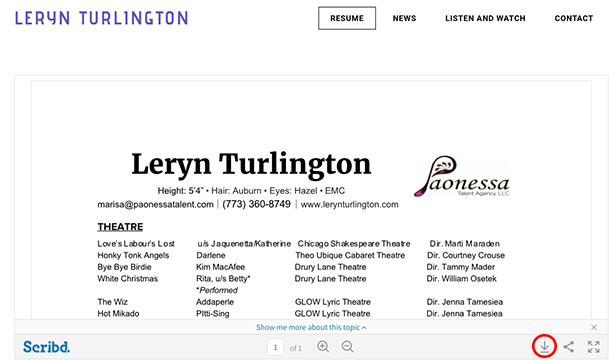
Your headshot and resume is your passport to the world of theatre, so it is important to make them big, easy to find and downloadable. The very first tab on my websites opens to a page with a “Scribd” app that hosts a downloadable PDF file of my headshot and resume.
2. What are you up to?

When you keep your website up to date, all the right people can keep tabs on what you’re up to and where they can find you. Make sure to put a link to ticket sales and any (brief) promotional material of productions you’re in so friends, family and others can get all the information they need. Here I have a trailer, running dates and ticket information.
3. May I have your attention?

Perhaps the most exciting thing about a website is having a place for your headshots, production photos, film reels, theatrical reels, and performances. Be very selective and brief with your media – assume your audience is only going to glance at the first 20 seconds of the first two selections. What would you most like them to see?
4. Your feedback is very important to us!

Contact information is very important. Make sure you have a separate email for professional-related correspondences or a contact sheet like this! Remember: never put any personal information online like where you live or who you live with. Also, if you have an agent, be sure to feature them and their contact information on this page as well.
5. Be YOU!

A brief “About Me” section is an opportunity for your website visitor to make more of a connection with you from the other side of the screen. Are you a yogi? Are you an active member of your community? Do you have your own styling business? As actors we are always striving to stand out in the crowd, and this is your website, after all! There is also a debate on many “Tips for Actor Websites!” articles over whether writing in third person works or not. I’ve come to decide that I think this is a personal decision. (See what I did there?) I personally believe when you strive to make a website that is clean and polished, a first person narrative feels a bit informal and incongruent. But again, there are more important things to worry about!
6. Coder or DIY?
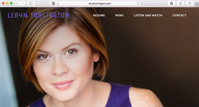
I felt confident in my ability to create a modern, stylish and user-friendly website but it would be wise to mention that I also had the time and none of the budget for hiring someone else. If hiring a web developer is within your means, go for it! The plus side to making my own is that I have full control over my page and how it gets updated (which is frequently!). I found Weebly’s interface extremely easy to manage and I pay about $30/year to have my domain name, LerynTurlington.com. It feels very fancy to have a domain and I’m quite fond of it.
7. Bonus: Press
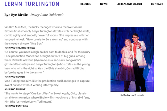
This section may not be relevant unless you have praise from critics, but if or when you do, leave a little space for the press! Good reviews and honorable mentions can help paint a picture of you as a performer for those who didn’t get to see your previous work. Remember to always credit the source!
Need some advice? We’ve got you covered.
- “Is my attitude not getting me roles?” And Other Essential Questions for Actors
- 6 Steps to Memorizing Shakespeare
- 10 Tricks to Staying Healthy All Season Long
- What Does It Take to Break Into Voiceovers?
- When You’re Not Into Acting, But You’re Still Into Theatre, Part 1
- When You’re Not Into Acting, But You’re Still Into Theatre, Part 2
- 5 Advantages of Having a Tertiary Role
- 5 Reasons You Shouldn’t Let a Bad Audition Define You
- 5 Tips for Nailing Your College Music Theatre Audition
- 10 Tips on Owning the Room at Competition
- How to Balance Theatre and Coursework
- The 10 Secrets of Great Understudying
- 10 Items Every Actor Should Carry in Their Rehearsal Bag
- 10 Items Every Dancer Should Keep in Their Rehearsal Bag
- 10 Remedies to Help Your Throat Survive Audition Season
